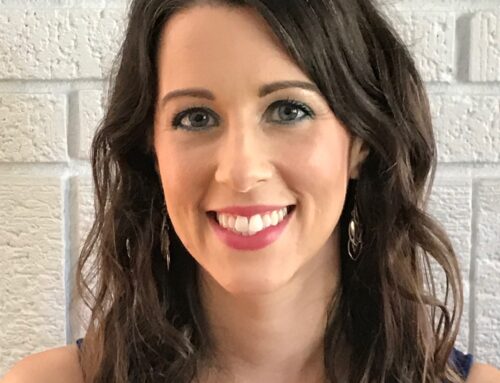
An Invent Your Image Client’s Color Journey- Guest Blogger
An Invent Your Image Client’s Color Journey- Guest Blogger
In some ways, one part of my color journey is coming to a close and in other ways it is just starting. I had NO idea this observation would apply to me, and in a way I never expected.
Very recently, I reached the point of being tired…… sick and tired of experimenting with anything having to do with makeup or color . It was fun diversion at first, but as the months wore on, it became a whole lot less enjoyable and instead morphed into a BIG exercise in head-banging-the-desk frustration. One wickedly early morning I woke up and I made the decision to just forget it!. I cleaned off my makeup table and desk from all the mayhem….streamlining everything. Already, I felt more peaceful. Cheating on the palettes I had previously been given became routine with nail polish. Bright blues, sparkles, bright pinks. Sometimes jewel toned purples and watermelons. I did not care. I enjoyed every minute of my rebellion and figured my fingers and toes were fair game. Next came lipstick. Revlon Sorbet, which fits many seasons, can be too bright on any of the Summers. There was a love affair with Wild Watermelon and Lollipop. Two lipsticks that had been in the arsenal for years that were not leaving the makeup collection were Prestige Aftershock and Wet and Wild 505A. MAC Pink Swoon blush and now discontinued Pinch O’ Peach stayed in their spot, as did a bright pink from Lorac and some Too Faced Perfect Flush Blush in Candy Glow I refused to part with. Eye shadow has always been a challenge, because nothing ever looks exactly right. I dug out a NYX trio that consisted of taupey browns and a nice light, clear creamy white. Along with it, some black brown mascara, NYX Gray pencil and Prestige Topaz. I could deal with this. Even so, I still was not totally at peace.
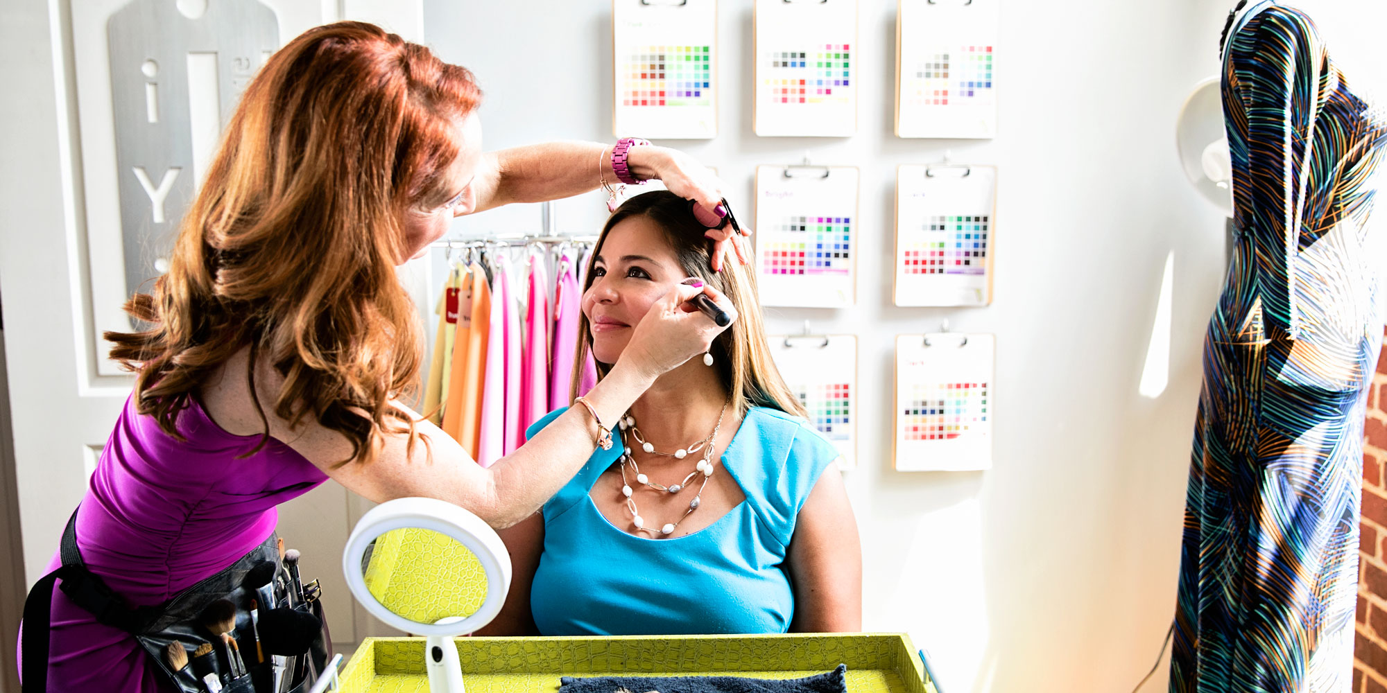
So, I gave Lisa Ford a call at the recommendation of two Facebook buddies and made an appointment. This would be my 3rd Sci/ART draping in almost as many years. As I neared Tampa, I recalled the inner voice in my head shouting, “YOU NEED BRIGHT COLORS!” which I tried to push off as bunk. It didn’t matter. I needed to see the process happen again step by step, that way doubt would be erased and I would have something I never got the other times:
Closure.
Lisa kindly invited me into her home and we filled out some preliminary paperwork. Normally, she would go through each seasonal category with me on the printouts, but she knew I’d been around the block a few times, so we dispensed with this, since this was clearly not my first rodeo. Then, I got seated in the little gray painted room with my gray cap and gray cape, lights shining on me. Deep breath…..the moment of truth was about to arrive….. I knew almost from the first test drapes, (gold, silver, black, brown) that something was going to be different this time. At first, I really could not see the changes in my face, but Lisa took the time to point out different features and really explain what was going on. Because my expressions were so animated throughout the whole process, (my face is an open book!) I had to tone it down a bit so she could see what was going on.
Wrong colors on me: Dulled the whites of my eyes. Made my face look rounder/chin and neck melded into one. White/ashy patches on my face. Blotchy red patches and unevenness. Made my facial contours around my chin and neck look fuzzy. Also made my facial features look one dimensional and flat. Right colors on me; Teeth and eyes looked whiter, creamy and even complexion, sparkle in the eye. Made me smile. Also the right colored drapes made me appear much more three dimensional. She mentioned that my coloring was easy to read.
First section of test drapes: Black was not bad, brown was good, gold was best and with silver my chin and neck looked like they fused together. I looked all evenly gray with no facial definition. Plus, I got ashy patches and white patches around my lips and chin.
Next came the True Season test drapes: The Summers were really bad. As a matter of fact, True Summer was my absolute worst. Every time she put a TSu drape on me, I made a face. Actually, we could not get those drapes off fast enough. The Winters were much better, but again, the True Winter test drapes were too cold and chilly. Pure white put white patches on my face and made me look frozen. Autumn warmth had a heaviness to it I could not carry. Spring was the best of the Trues, but it yellowed me out just a little bit.
There are four complete sets of Red test drapes: Light, Medium, Bright and Dark. The Lights were very washed out on me, but my best test colors were the neutral and the warm, with neutral winning. The coolest light pink was HORRIBLE. The Medium red test drapes were tested. Again, the coolest one was so bad it was laughable. The warmest one was a touch too warm, but the neutral was best. Still, it appeared I need a bit more oomph than this. The Bright red test drapes also showed I looked best in neutral with warm being second best. The warm drapes across the board were too warm for me, but not completely off the mark. The Bright red drape set was my best. The Dark test drapes were a little heavy on me. Sure enough, the coolest one was horrid. The neutral drape was much better and the warmest one was definitely too warm.
Next we went through the test drapes for each of the Neutral seasons. Both of the Lights were just too wishy washy. They did nothing for me. Summer colors in general and Summer blended colors just make me look very uninteresting and blah. Summer colors also made my lips turn bluish! Both of the Darks weren’t bad, but they had a heaviness to them that weighed me down. They also cast some shadows on my face. Softs were so terrible they aren’t even worth mentioning. They were bad the first time I was draped, and this time around was no exception.
It was at this point Lisa said I were in between a Winter and Spring. (I was staring to get all giddy inside…..that loud inner logical voice was telling me a truth I was not ready to see earlier!)
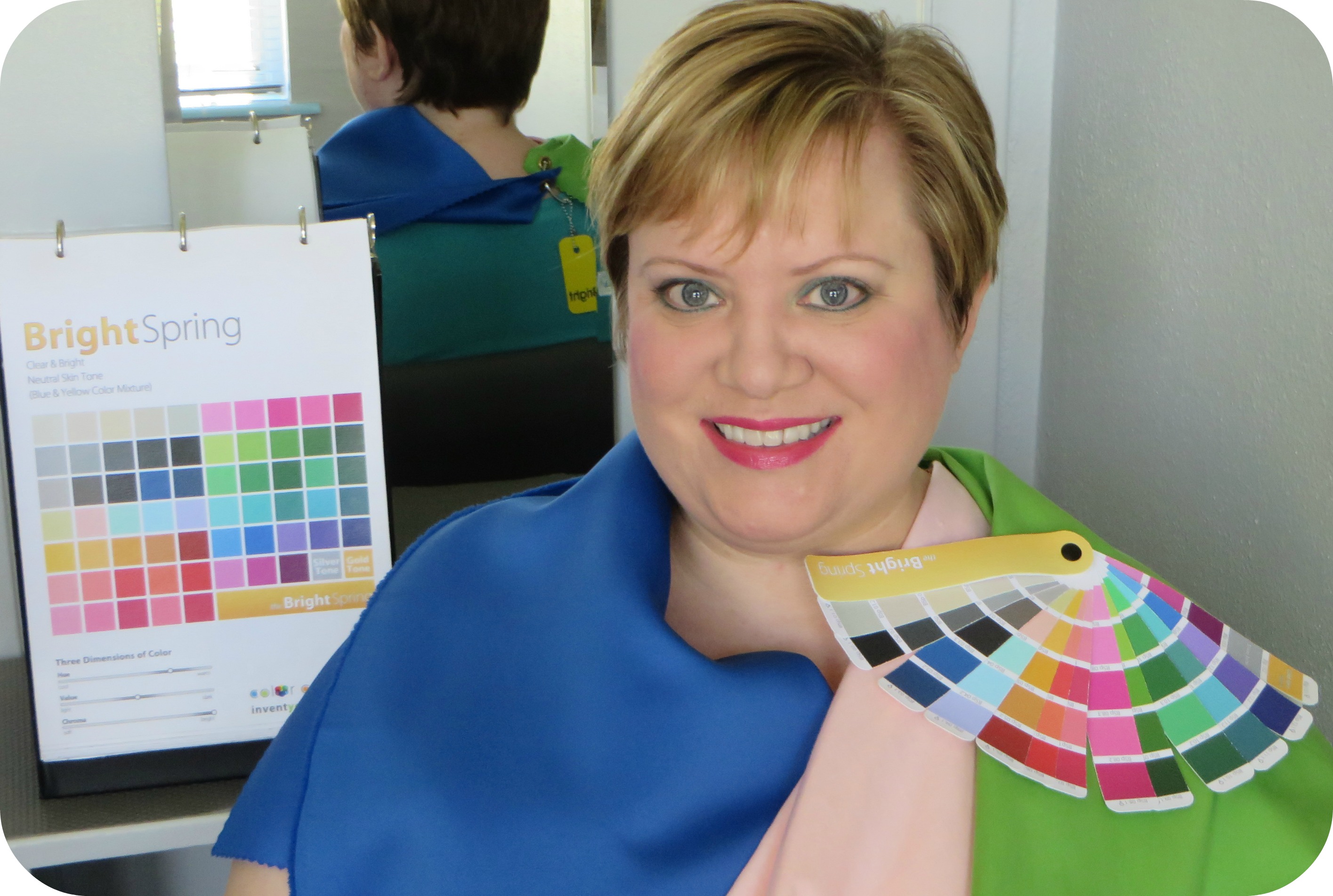
True Winter being way too icy and True Spring being too warm, it was down to two. Bright Winter and Bright Spring. Really, it was no contest. It was plain to see that Bright Winter was the right intensity, but especially when we got to the sapphire drape, you could readily see it was too cool, deep and “sharp”. Actually, all of the Bright Winter test drapes were too cool and icy on me. It was at this point we declared Bright Spring the winner! I do not lean one way or the other. If anything, Lisa says that I am solidly in my seasonal category, so no cheating. Now to play with my new Bright colors!!!!
The biggest surprise for me was discovering how much chroma I need to look balanced. When I arrived, I really thought that there would be drapes that would run me over and dominate me, but even the brightest of the drapes looked normal. Another big surprise was the realization I was NOT Summer in the least!
So…that’s it. That is my color story, the final chapter.
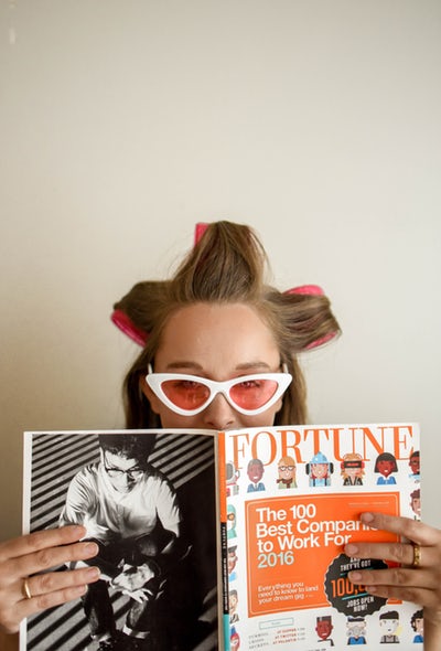
Tina C. Bright Spring
Enjoyed Tina’s color analysis story? Let us hear you color commentary in the comment box below.
Welcome to your true color world! This gave me flash backs of my color session with Lisa – it was the best decision and investment that I made for myself! Have fun shopping in your bright spring…


Welcome to your true color world! This gave me flash backs of my color session with Lisa – it was the best decision and investment that I made for myself! Have fun shopping in your bright spring…
Amy – Dark Autumn
Thanks Amy for commenting and taking the time to read Tina’s color story.