My 12 Tone vs. Personalized Color Analysis Experience
My 12 Tone vs. Personalized Color Analysis Experience
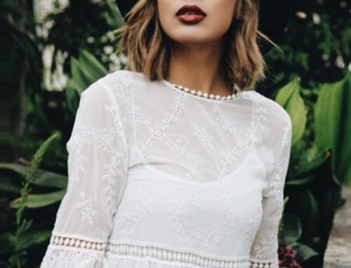
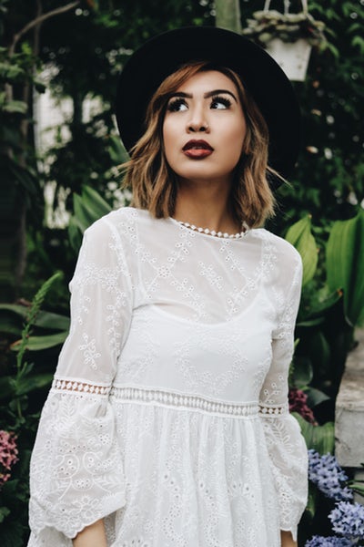
As of lot you, I had my colors analyzed in the 80’s when there were just the 4 seasons and I was placed in the Autumn color palette. So for 23 years I was wearing colors that were unfavorable for my skin tone. Autumn colors on me read two dimensional and my skin pulls too much of my carotene to the surface creating a muddy look.
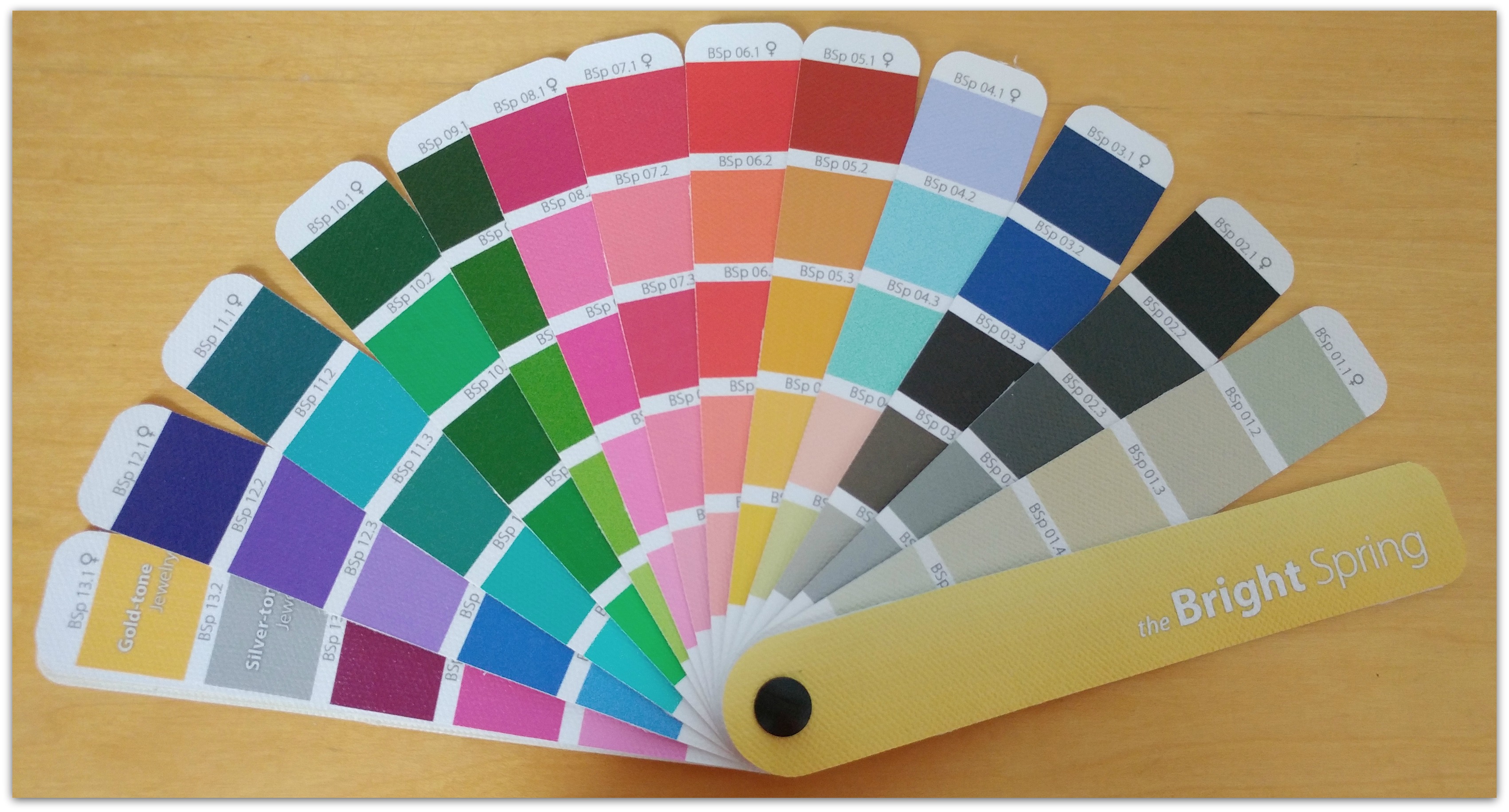
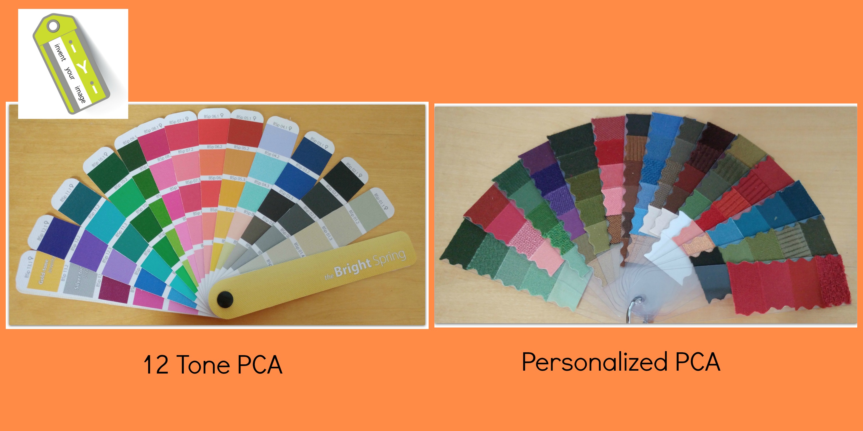
Fast forward to 2007 when I was introduced to 12 Tone Color Analysis by Kathryn Kalisz who unveiled my colors, during my PCA certification course, as a Bright Spring. I was hooked to the whole 12 Tone Color Analysis system and still practice it to this day.
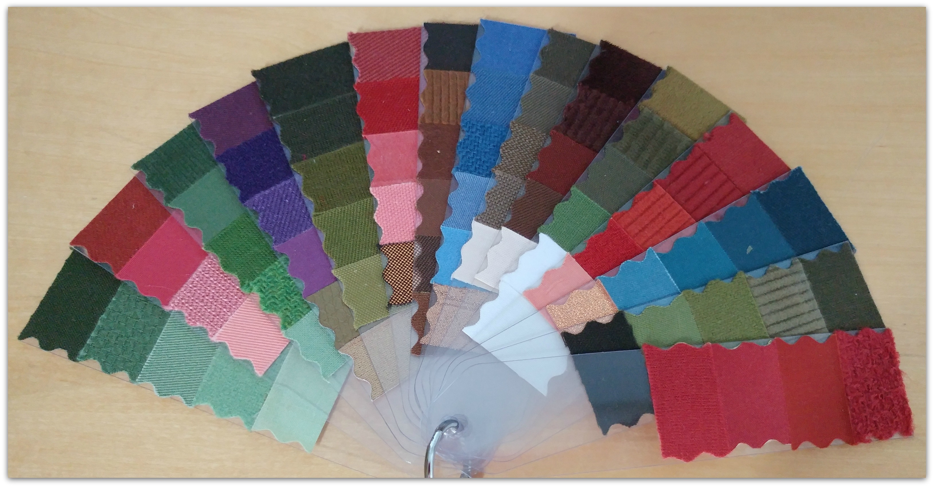
But I still had a curiosity about other color analysis methodologies. So I went to an analyst that practiced personalized color analysis. Here is what she determined to be the best colors for my skin tone. Plus she gave me 3 color wands with my eye, hair, and skin color.
Yes both these color spaces possess differing dimensions of colors.
I do want to make very clear that I am not discounting the validity of either color analysis system. I truly believe it comes down to the client’s personal preference on;
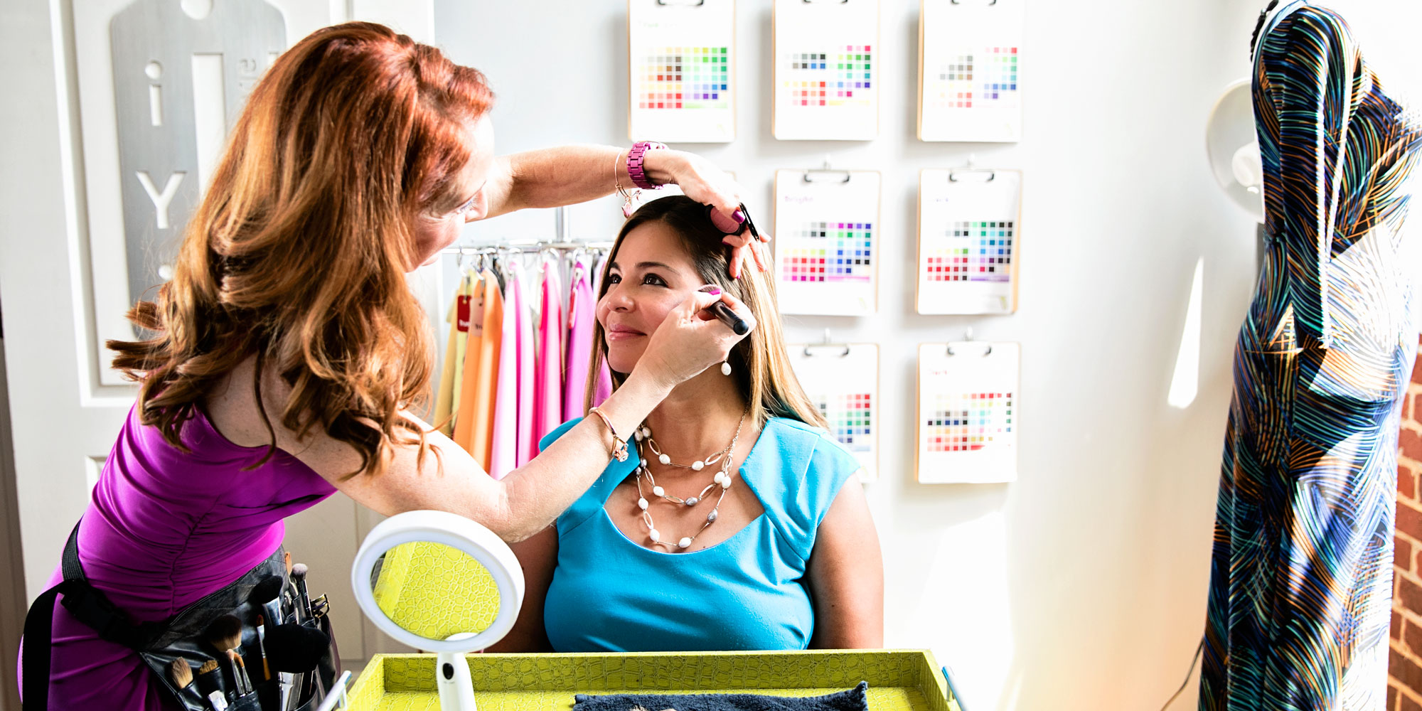
Test drapes or Color Chips?
Book of colors- canvas, material, or paper?
Standard or Customized color fan?
Wear your body colors or colors that are favorable for your skin tone?
Observe the results during the session or only the analyst views outcome?
For me I prefer test drapes, canvas book of colors, colors that are harmonious with my skin tone, and observing results during the PCA session.
I know this topic is highly debated! I would love to hear your PCA preference and why. Scroll down to the comment box below to share your thoughts.
I am a Certified Personal Color Analyst in the Sci/ART 12 Tone Technique created by Kathryn Kalisz. I trained with Nikki Bogardus of My Color RX in Naples, FL and purchased a set of Kathryn’s original drapes. I live in Newport Beach, CA and just finished setting up my business “mycolorseason.com”. I purchased the color fans
that are printed on canvas from True Color in Australia and like them very much. In the meantime, Nikki Bogardus has invented her own Prism VII fans that are supposed closer replications of the Munsell colors. Have you had a chance to see them? They are a lot less expensive than the canvas, however, they are printed on shiny paper and I’m not sure that they show the colors as well. I would love your opinion on which color fans you like best and if it is possible for me to purchase them at a whole sale price? In addition, I love your website because it reveals your fun and bright personality! I am in the process of developing mine.
I hope to hear from you and Happy New Year!
Kind regards,
Lisa Houssels
Lisa congrats on your color analysis business. I produce my own books on canvas and I retail them for $75 and sell wholesale to analyst that train with us- Invent Your Image. I hope that helps and good luck.
Hope your color business is going well. I produce my own drapes and books of color on canvas. I also train like Nikki. If you want to reach me with question you can call me at 813-766-8375 or lisa@inventyourimage.com
Grace
February 6, 2017 at 10:39 pm
I’d love to know your opinion on stylists who only do it based on hair color. What do you think of the results?
Also, I’m reading a lot of different opinions on online vs offline / in person consultations. Any thoughts?


Hi Lisa!
I am a Certified Personal Color Analyst in the Sci/ART 12 Tone Technique created by Kathryn Kalisz. I trained with Nikki Bogardus of My Color RX in Naples, FL and purchased a set of Kathryn’s original drapes. I live in Newport Beach, CA and just finished setting up my business “mycolorseason.com”. I purchased the color fans
that are printed on canvas from True Color in Australia and like them very much. In the meantime, Nikki Bogardus has invented her own Prism VII fans that are supposed closer replications of the Munsell colors. Have you had a chance to see them? They are a lot less expensive than the canvas, however, they are printed on shiny paper and I’m not sure that they show the colors as well. I would love your opinion on which color fans you like best and if it is possible for me to purchase them at a whole sale price? In addition, I love your website because it reveals your fun and bright personality! I am in the process of developing mine.
I hope to hear from you and Happy New Year!
Kind regards,
Lisa Houssels
Lisa congrats on your color analysis business. I produce my own books on canvas and I retail them for $75 and sell wholesale to analyst that train with us- Invent Your Image. I hope that helps and good luck.
Lisa,
Hope your color business is going well. I produce my own drapes and books of color on canvas. I also train like Nikki. If you want to reach me with question you can call me at 813-766-8375 or lisa@inventyourimage.com
I’d love to know your opinion on stylists who only do it based on hair color. What do you think of the results?
Also, I’m reading a lot of different opinions on online vs offline / in person consultations. Any thoughts?